
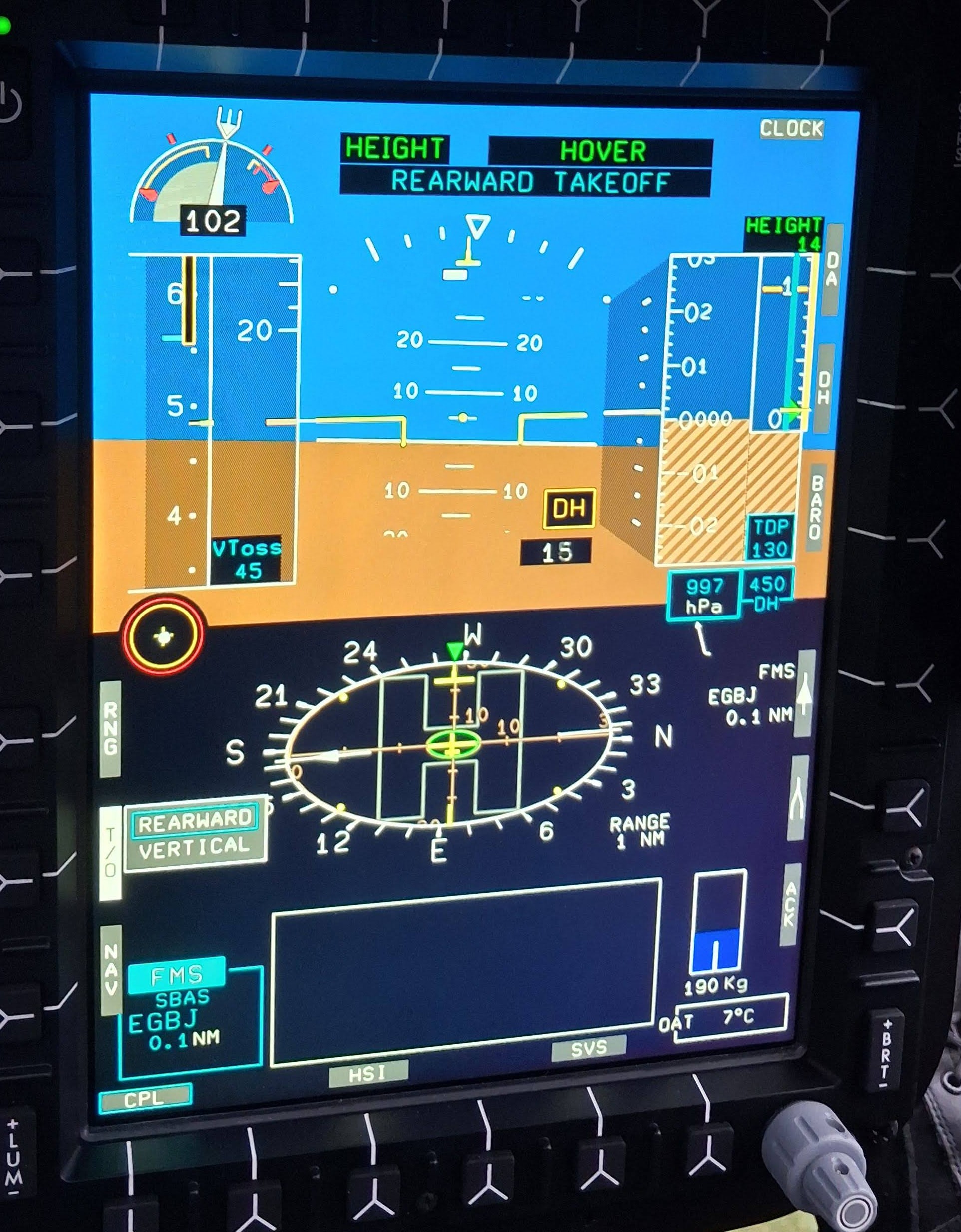
Anyone who has flown a few glass cockpit aircraft will have noticed that gauges that use strips for airspeed and altitude seem to be in fashion at the moment. However some aircraft manufacturers seem to have stuck with dials even in the digital age – particularly Sikorsky and Bell. Are strip gauges the right way to go or will dials live to fight another day. Or has the battle of the displays been completely misunderstood?
In this article we look at how aircraft cockpits have changed in the “glass” age and how some designers may need to think a little harder about how pilots assimilate data and how to make really useful gauges for the future.
Let’s get stuck in.
Contents
The age of the dial
From the very early days of the industrial age, dial type gauges have been used to indicate the value of a parameter. The earliest dial type gauges were used on steam engines to safely indicate the pressure inside the system (in the UK, the first steam pressure gauge was patented by Mr Sydney Smith in 1847). A typical steam boiler whether it was in a factory, a ship or a locomotive had many such gauges.

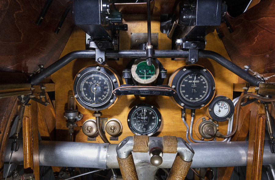
By the time flying machines came along, the dial type gauge was a mature technology. Note the small collection of dial type gauges in the Sopwith Camel F.1 from the Royal Flying Corps.
Why dials are useful
As we have already mentioned, dials were a mature technology by the time heavier-than-air aircraft were flying. What else made them a practical way to display information?
- Simple and reliable technology
- Large range of indication in a compact area
- An approximate indication can be determined without reading the numbers on the card (eg in the Camel if the RPM needle was straight up, the RPM was approximately 1500 rpm)
- Multiple revolutions of the dial can be used to make the gauge even more compact (eg on the Camel, the altimeter goes from 0 to 15000 ft in one revolution then carries around again up to 20000 ft
- A dial type gauge can be used to depict looping parameters like magnetic heading in a simple way. The compass on the Camel is a good example
So given these admirable qualities, why would designers use anything else?
Early strip gauges
Of course designers have used other types of gauges for as long as we have had machines. An early example is the water level gauge in the boiler of a steam engine. A simple glass tube could be used to show the actual water level by simply connecting it to the boiler. An example is shown below.

What advantages does the strip gauge offer?
- Logical display of information (eg vertical displacement showing vertical change in water level)
- Easy to get approximate reading without looking at the scale (if there even was one)
Of note, in some steam boilers, these sight gauges were replaced with dials because having boiling hot water or steam behind a breakable glass tube was found to be not a great idea. Note all the valves to isolate the gauge if it broke in the image above.
So many dials
As the complexity of aircraft increased, more dials were needed to cover all of the relevant parameters. In the early 1980s, large commercial airliner started to introduce “glass” cockpit through Cathode Ray Tube (CRT) displays for flight and navigation parameters. But helicopters continued to use dials for a few more years. The BK117 C1 is a good example of peak dial-based cockpits.
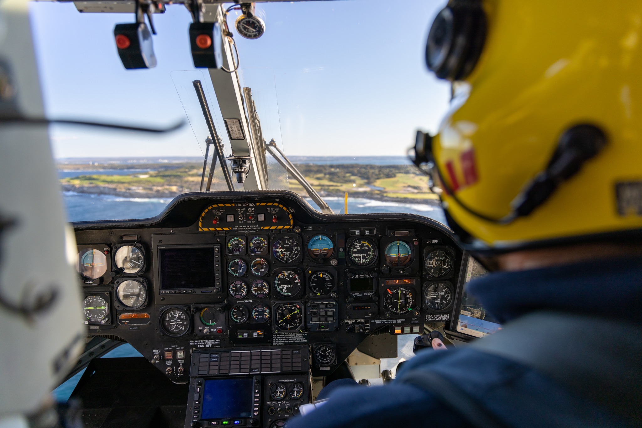
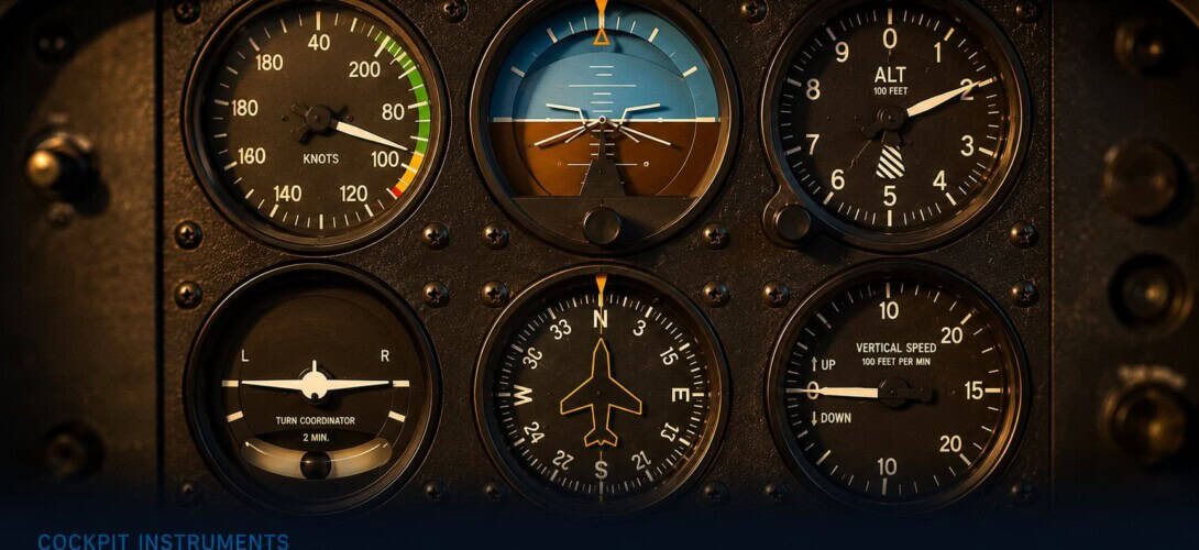
Note a few points about the cockpit. The flight displays are in a classic T-shape. The artificial horizon is in the centre of the pilot’s view with airspeed to the left, altitude to the right and horizontal situational indicator below. The vertical speed indicator is bottom right. There is also the turn and slip bottom left but this does not tend to be a separate display on helicopters – in the BK117 C2 above the slip indicator is directly under the artificial horizon. Check out Aero Corner for a deeper explanation of the classic six pack.
The first modern strip gauges
Helicopter manufacturers began to introduce glass cockpits in the early 1990s. The BK117 C2 is an example of how this was achieved.
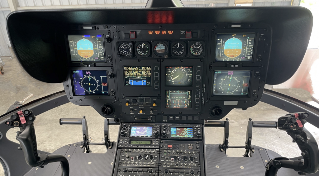
Let’s look a bit closer at some of the strip gauges.
Primary Flight Display (PFD)
The first display to consider is the PFD. Instead of dials for the altitude, vertical speed (VSI) and airspeed, we now have strip gauges. For this example we will use the PFD from an EC135 as it is nearly identical to the BK117 C2 shown above.
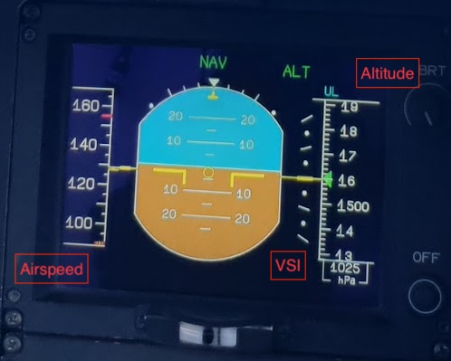
As can be seen above, despite moving to strip gauges, Airbus has preserved the presentation of airspeed to the left of the artificial horizon and altitude to the right. However, they have taken the opportunity to bring the VSI up to the same level as the artificial horizon. This makes a lot of sense as the VSI is essentially a trend indicator for the altimeter. At the same time, Airbus put a trend arrow for the airspeed indicator onto the airspeed display. Now the pilot has a very small scan to gather all the necessary flight data. But is this change all good?
Issues with strip gauges
We now have a nice compact display, but is it all a good thing?
- Reading the display – As mentioned earlier, one of the advantages of a dial was that an approximate value could be determined by glancing at the needle. We have now lost our needle so now we need to actual read the numbers to work out our speed. This cognitive load is not insignificant. Is it 60 or 80? You will not Airbus have added coloured marks to help orientate the pilot.
- Which way is up? – The airspeed indicator has a higher speed at the top. But to accelerate the pilot has to push the nose down. This contradiction is very quickly overcome by pilots transitioning to glass so it is not actually a major issue.
- Big picture – The strip gauges only show a small portion of the whole range. Looking at the airspeed indicator it is hard to get a feel for where the pilot is in the whole speed range without some interpretation. This was much easier on a dial.
Are all strip gauges the same?
OK there are some small issues with strip gauges but they seem to work. But are they actually all the same? Look at the VSI. What makes it different to the airspeed and altitude displays?
The major difference is that while it is a strip gauge it is a fixed strip with a needle. You can get an approximate reading at a glance and you can get a feel for where you sit in the full range. Up and down make sense. So how can one strip gauge have a problem and another one be just fine?
The real difference between gauges
This highlights that there is something else going on here. It is not simply a difference between rotary dials and strip displays. It is all about how the data is presented. The key difference is between two options:
- Fixed indication and moving display
- Moving indication and fixed display
Let’s look at some examples
Fixed Indication – Moving Display
Here are a few examples, some of which we have seen already.
Airspeed Indicator

The fixed point is the yellow datum mark on the right of the display. The current airspeed is shown on a moving strip. Only a portion of the speed range is shown. The display has the following advantages and disadvantages:
- Advantages:
- Compact display – we do not need to show the whole speed range
- More precision – As the display is only over a small speed range, the accuracy of the mark is better for the same display real estate
- Disadvantages:
- Reading – the pilot has to read the numbers to get information
- Big picture – it is harder to get a feel for where you sit in the whole speed range
- Opposite sense – acceleration requires pushing the nose down which is opposite to the speed going up
Horizontal situation indicator (HSI) / compass
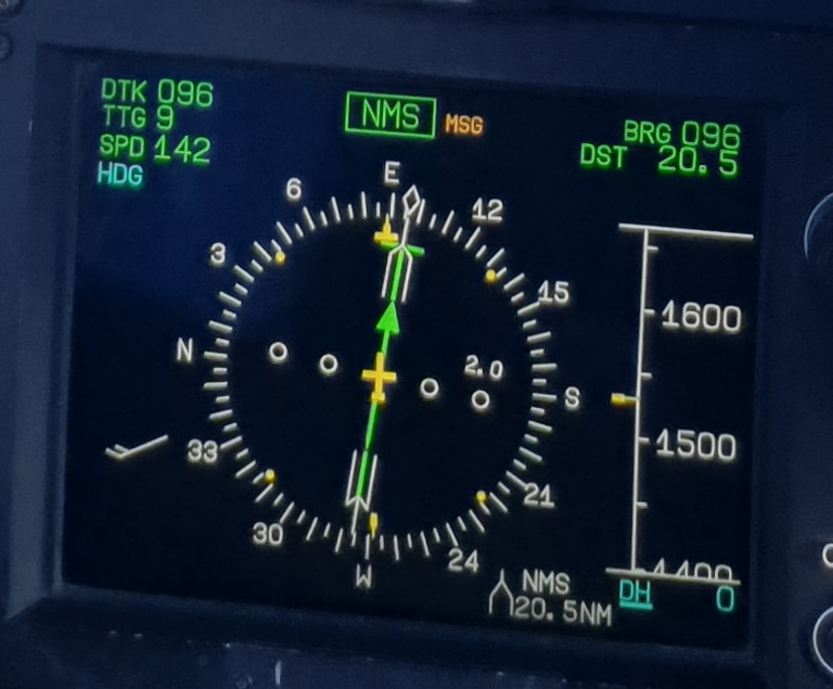
The HSI on the EC135 is presented on the lower screen – the Navigation Display (ND). The fixed point in this case is the yellow datum mark at the top showing the heading to be 088 degrees. Of note, we note can see the whole range of indications for the parameter and we can see our position relative to the whole range. With the size of the gauge we can see our heading to a suitable degree of accuracy. Given the use of N S E W it is also quite easy to get a feel for our heading at a glance without reading the exact numbers of the display.
So we have now taken all of those disadvantages of the airspeed gauge and made them a positive with the same type of gauge. This demonstrates it is all about tailoring the gauge to the requirement.
Radar altimeter
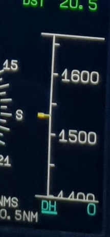
The radar altimeter on the EC135 is presented to the right of the HSI on the ND. The fixed indication is the yellow datum mark. This display again requires the pilot to read the number to appreciate the actual height of the aircraft. Whilst the “ground” does get shown in the background as a brown area at very low height (sub 200 ft) otherwise the pilot is unaware of the height.
The biggest issue with the display is looks nearly identical to altitude. Many pilots have confused the 2 and done things that should be done at a height when then should have been done at an altitude (eg accelerating during take off at 200 ft above the take off point)
Let’s look at the other type of display
Moving Indication – Fixed Display
Some manufacturers have not followed the pack with moving to strip gauges when moving to glass. These are great examples of this type of display with a moving indication on a fixed display.
Airspeed indicator
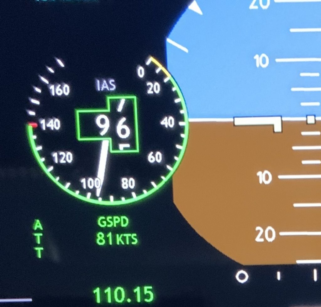
On the Bell 429, the airspeed indicator is still a dial type display. This is an example of a moving indication (the needle) with a fixed display. Compared to the EC135 display, it offers several advantages and some disadvantages:
- Advantages
- Easy to get approximate information – without reading the numbers it is very easy to get a rough idea of speed just by looking at the needle position
- Big picture – you can see where the aircraft sits in the whole speed range
- Trending – the rate of movement of the needle can be used by the pilot which means that a speed trend indicator is unnecessary
- Disadvantages
- Real estate – the gauge takes up a little more real estate than a strip gauge
Radar altimeter
On some aircraft, the gauge for the same parameter changes dependent on the operating scenario. For example on early Merlin helicopters, the hover display included a radar altimeter on the right side. This was not shown when the display was set to the navigation display.
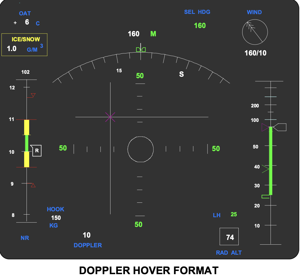
This radar altimeter is a fixed strip with a moving indication (the white boxed arrow shape at 74 feet). The ground is a the bottom and 500 ft is at the top. Of note the display is not linear. The portion below 200 ft gradually expands to give more space to critical heights for the intended operation. At a glance (with practice) it is easy to determine an approximate altitude without reading the digital number. Trends are easy to pick up without a trend indicator. For hovering work this is a far better depiction of the radar height parameter than the EC135 version.
Conclusion on type of gauge
From the above comparison of gauges, the main takeaway is that the type of gauge used should be:
- Tailored to the parameter
- Tailored to the role
But is this a problem that only relates to flight parameters? What about monitoring other systems like the engine or transmission?
Gauges in aircraft monitoring
Looking at the rest of the cockpit, there are clearly many more gauges than just flight displays. The same issues and choices have a huge impact on their utility to the pilot. Let’s look at some temperature and pressure indications.
Engine and transmission monitoring
Temperature and pressures and similar indications, naturally lend themselves to a moving indication on a fixed display.
Helionix
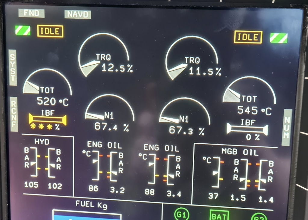
On the Airbus Helionix system, Airbus has used both strips (temperatures and pressures) and dials (Torque, N1, TOT) to represent various parameters. In each case, the nature of the display mean that no numbered scale has been included with the display and digital reading being sufficient.
The pilot at a glance can get a strong feel for the state of the indications of engine and system health. The dial-type displays along the pilot to get a much better appreciation of trend in a small bit of display real estate. Note the use of colour is fundamental to comprehending the indications. Yellow is caution, red is warning. Note also that the displays are not green when normal (see the Bell 429 airspeed indicator for comparison. This means an Airbus pilot will say everything is “…in the black…” rather than “…in the green…” as some other pilots might say.
Bell 429
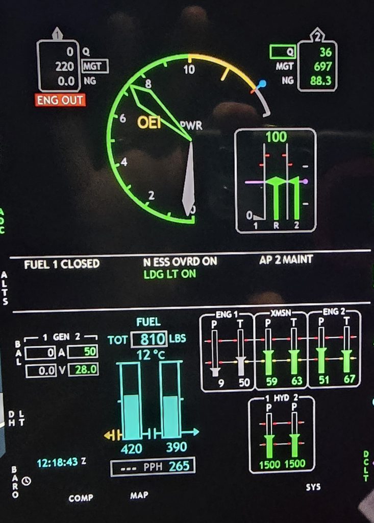
On the Bell 429, the temperatures and pressures are again shown in strip gauges. In this case however, the scale of the various parameters has been adjusted to show the maximum and minimum permitted levels to be at the same height (the lines through the display. This makes it even easier to work out if things are ok. Note how the indications for the number 1 engine are greyed out to show the engine is in an abnormal state. Colour can make a huge contribution to display comprehension.
Note also that the fuel quantity is a moving indication on a fixed display. The main gauge dominating the Bell 429 is the Power Situation Indicator (PSI). This a moving indicator on a fixed display and makes it very simple for the pilot to determine their power situation related to the whole power range. The big sweeping needle makes judging power input easy. Airbus used a very similar display on their early glass cockpits then changed to a strip gauge with a fixed indication. Let’s look at this more closely as it is a good example of how display choices can go wrong.
First Limit Indicators (FLI) / Power Situation Indicators (PSI)
We have covered some issues with FLI and PSI before – take a look here. But they are not all created equally. Let’s compare early and late version FLI made by Airbus. They are completely different in their implementation.
EC135 CPDS
On its early glass cockpits, Airbus introduced the First Limit Indicator. This dial-type display have a moving indicator (needle) and a fixed display. The needle was driven by one of three parameters (torque, engine speed or engine temperature) to show how the state of the parameter relevant to its limits. The gauge was non-dimensional with 10 indicating the normal power limit and 0 representing a very low state (eg 165 degrees in the example below).
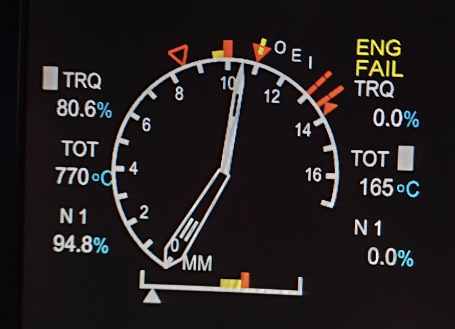
The FLI was displayed in large format on the centre of a Vehicle and Engine Management Display (VEMD) upper screen and was very easy to interpret and to pickup trends. At a glance the power state could be determined. The caution and warning ranges were fixed in place on the display so power could be easily managed.
However for Helioniox, Airbus changed how the FLI worked.
Helionix
For Helionix, Airbus made the design choice to move from a moving indicator with fixed display to a fixed indicator and moving display. The moving display became a collective lever position indication (full up = 10, full down = 0). Limitations are superimposed as coloured markers which move themselves in relation to the background.
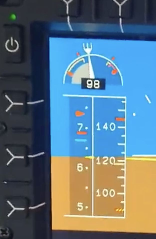
This change may have been primarily due to a lack of real-estate on the PFD. The gauge is squashed in next to the airspeed strip. Note above it is a NR/N2 gauge which is still a moving indicator on a fixed strip.
The Helionix FLI is not substantially harder to read than the earlier fixed dial-type display on EC135. Whilst compact it has picked up many of the disadvantages we have already covered:
- Big picture – It is hard to work out the power in relation to the whole power range.
- Moving limits – The limitation indications move about relative to the scale. There is not a direct link between collective position and the limit. There was such a link between the FLI number on EC135 and the limit so they didn’t move.
- Trending – it is more difficult to pick up a trend from the moving strip than it is to get that information from a needle.
However, the vertical nature of the strip does logically relate to pulling up on the collective (a higher indication is achieved by pulling up on the lever).
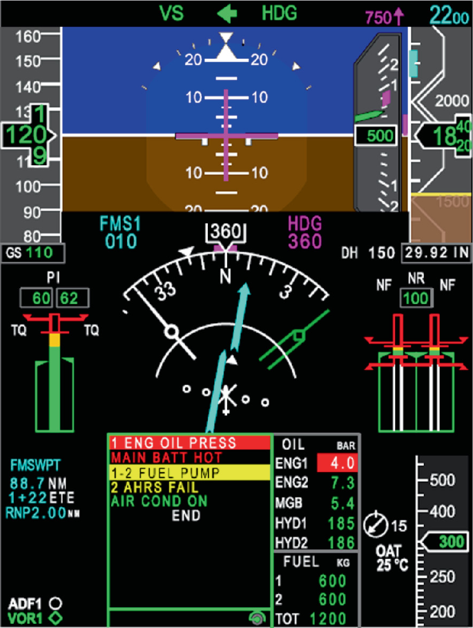
Many pilots would prefer the original dial-type display, but there are other ways of displays the information. Of note, other manufacturers have used a vertical strip-type display for similar indications. On the AW139 for example, the Power Index (PI) display on the left of the PFD is a moving indicator on a fixed strip with the most limiting parameter driving the indicator (in this case Torque on both sides (TQ)).
Have Airbus made a mis-step with an otherwise superb display of flight information on Helionix? Should they have gone for an FLI similar to the PI on AW139?
Summary
The change from dials to strips in the age of the glass cockpit is not quite as it seems. It is rather a choice between moving the indication or moving the strip. For some cases, there is a clear case for a fixed indication and moving strip (eg the HSI). In others a fixed strip and moving indication are the clear winner (temperatures and pressures). For yet further cases, there is still a split between manufacturers on the best way forward (airspeed indicators!). Are display designers really thinking hard enough about the human factor?
What experiences do you have with good and bad gauges? Comment below.
Now take a look at our other articles.
- FSTD Capability Signatures (FCS) – A hidden threat for training?

- Preparing for complete loss of engine power in helicopters

- Lessons in how to manage a helicopter engine malfunction
- Light twin helicopter AFCS – Have Airbus won the race?
- Maintenance by pilots – can the training be improved by sharing?

- Flight simulation revolution – A new method for matching training need to simulator capability
- Helicopter Single Engine IFR – New horizons

- Making the grade – understanding climb gradients in the go around

- Unfair Skies: Restrictive helicopter instructor rules and how to fix them
- How to create an instrument rating instructor (IRI) – A helicopter anomaly

- The evolution of Category A Helipad procedures – A strong foundation for VTOL to learn from?

- Strips vs dials – Which is better?
- Under the weather – are UK HEMS weather rules broken?

- Mastery of the GTN 750 – Ten things you should know
- Checking anomalies – The weird requirements of helicopter proficiency checks

Leave a Reply